


Visual Style Guide
go.ncsu.edu/readext?460449
en Español / em Português
El inglés es el idioma de control de esta página. En la medida en que haya algún conflicto entre la traducción al inglés y la traducción, el inglés prevalece.
Al hacer clic en el enlace de traducción se activa un servicio de traducción gratuito para convertir la página al español. Al igual que con cualquier traducción por Internet, la conversión no es sensible al contexto y puede que no traduzca el texto en su significado original. NC State Extension no garantiza la exactitud del texto traducido. Por favor, tenga en cuenta que algunas aplicaciones y/o servicios pueden no funcionar como se espera cuando se traducen.
Português
Inglês é o idioma de controle desta página. Na medida que haja algum conflito entre o texto original em Inglês e a tradução, o Inglês prevalece.
Ao clicar no link de tradução, um serviço gratuito de tradução será ativado para converter a página para o Português. Como em qualquer tradução pela internet, a conversão não é sensivel ao contexto e pode não ocorrer a tradução para o significado orginal. O serviço de Extensão da Carolina do Norte (NC State Extension) não garante a exatidão do texto traduzido. Por favor, observe que algumas funções ou serviços podem não funcionar como esperado após a tradução.
English
English is the controlling language of this page. To the extent there is any conflict between the English text and the translation, English controls.
Clicking on the translation link activates a free translation service to convert the page to Spanish. As with any Internet translation, the conversion is not context-sensitive and may not translate the text to its original meaning. NC State Extension does not guarantee the accuracy of the translated text. Please note that some applications and/or services may not function as expected when translated.
Collapse ▲Page Menu
- Using the Logo
- Incorrect Logo Usage
- Logo Downloads (incl. 4-H)
- Licensed Vendors
- Shadow Guidelines
- County Center Names
- Logo Versatility & Separation
- Color & Font
Partnership Logo
The co-brand logo is integral to N.C. Cooperative Extension’s identity, as the symbol of our strategic partnership. It is simultaneously clear, confident and dynamic.
Through the logo, we convey a strong, clear connection between N.C. Cooperative Extension and our state’s land-grant universities. By using the logo in a consistent and appropriate manner, this unified presence will add value and recognition to our N.C. Cooperative Extension partnership.
There are two base configurations of the logo: STACKED and HORIZONTAL. Use the appropriate version for your project.

REFERENCE GUIDE
A Quick Guide to the N.C. Cooperative Extension Brand
Using the Logo
The co-brand is a singular graphic, which should be used as one image in its original proportions. The logo should be used in a prominent position on all communications.
The designer may decide where to place the logo, so long as it is immediately visible on the introductory portion of a resource (e.g. publication cover, front page of a handout, top of webpage).
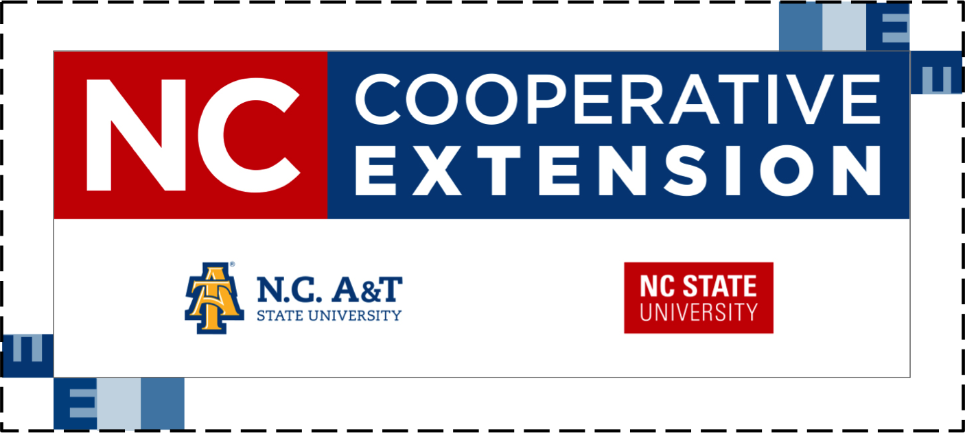
Give the logo space. As a rule of thumb, measure the height of the letter “E” in the word Extension. Design elements, text and photos should be at least that far from the logo.
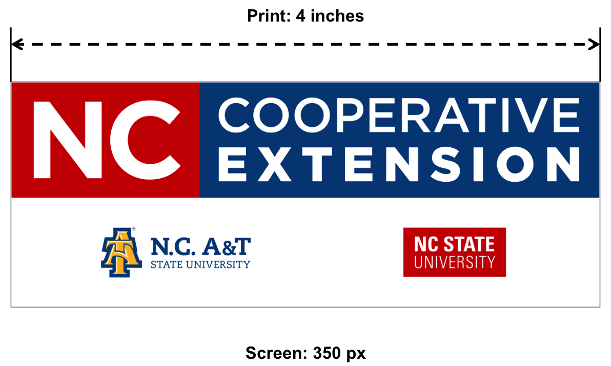
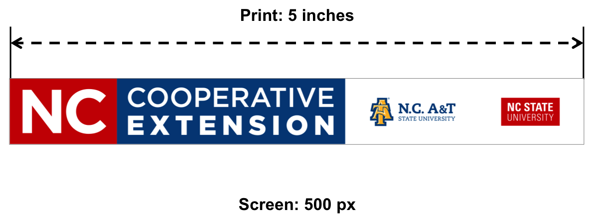
Minimum logo sizes. Use the appropriate size in all materials, and remember to scale the logo proportionately.
- Color is preferred when possible, but there are also Black and Grayscale versions of the co-brand.
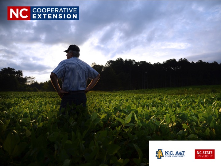
- When using the full color co-brand, it is preferable to print on a white background (or other “natural” backgrounds like a light beige, etc.). It is acceptable to superimpose the co-brand over imagery, but only when placed over light background colors without busy scenes.ACCEPTABLE: Placing the co-brand over an image of the sky at dusk.NOT ACCEPTABLE: Using the co-brand over an image of a crowd of people with numerous colors and distracting activity behind it.
- When printing on black, it is preferable to use a one-color version of the co-brand.
- The color co-brand can be used on black backgrounds if needed, but the N.C. A&T logo should be all gold in color (see Color section for specific palette).
- A design vendor can convert the black logo into the appropriate version.
Visit Logo Downloads for all logo files.
Incorrect Logo Usage

> Be mindful to resize the logo in equal proportion; do not distort the dimensions by stretching or scrunching the logo.
> Do not resize individual portions of the overall graphic, such as making the university logos bigger or repositioning them.
> Make sure your art vendor or others do not attempt to change the font or other design elements.
Why Can’t I Change the Logo?
Consistency is the cornerstone of effective branding and marketing. Using the same imagery on a consistent basis establishes brand identity and recognition in the market.
Regular use of our co-brand also reinforces the connection between N.C. Cooperative Extension and the partnering universities, helping people understand who we are and the value we provide. Over time, this repetition helps grow trust and value for the logo as well as the entities for which it stands.
As such, changing the colors, arrangements, fonts or text of the logo defeats the purpose of brand identity and is not permitted.
Logo Downloads
You can view or download N.C. Cooperative Extension logos all at once (organized by print and web/digital uses) or individually as needed.
PRINT FOLDER
Contains EPS files, which are the only logos that should be used for print, as these vector files will print without loss of quality at any size.
WEB FOLDER
Contains JPG logos that can be used for Microsoft Office documents, like Word and PowerPoint, or on websites.
4-H FOLDER
Contains logo files for Extension 4-H program marketing, including both the 4-H clover and joint 4-H / N.C. Cooperative Extension logo samples.
Visit the Marketing Resources section for all N.C. Cooperative Extension logos.
Licensed Vendors
The use of NC State trademarks (e.g. university logos and wordmarks) on products or promotional items requires that the product be produced by a licensed vendor. This includes use of the N.C. Cooperative Extension partnership logo.
View list of licensed vendors.
Vendors are able to apply for a trademark license. Visit the NC State Trademark Licensing website for more information.
Shadow Guidelines
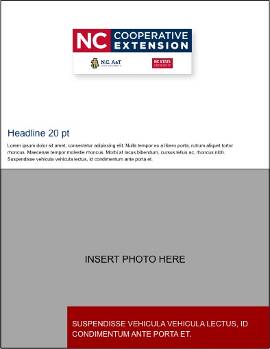
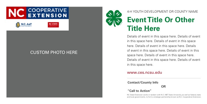
The base co-brand includes drop shadow to provide a natural outline and boundaries, which helps define the shape and its place within the overall communication piece. At times, however, the drop shadow will not be needed and may be removed.
Rule of thumb…
- Use the version with shadow if there is excess open space around the logo (lots of white space) – this creates an outline so the logos aren’t just floating – see first example below
- Use the version without shadow if the boundaries on the final piece are close to the logo (e.g. edges of the paper, surrounding text, etc.) – see second example below
Back to Top
County Center Names
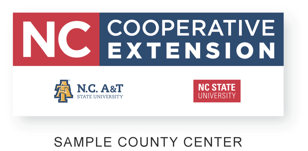
When adding a county center name to the logo, use the format:
“COUNTY NAME CENTER”
- Arial font – size should be roughly equivalent to “N.C. A&T” logo text
- Use ALL CAPS
- Center below the university logos
Template for Logo + County Center Name
Download the Template (PPT) for adding a county center name to the logo. Follow these steps to utilize the template and create a county-specific N.C. Cooperative Extension logo image file:
- Choose the logo version that’s appropriate for your communication
- Type your county center name into the “Sample County Center” field
- Right-click the final image -> select “Save as Picture…” -> choose JPEG as the format
Logo Versatility & Separation
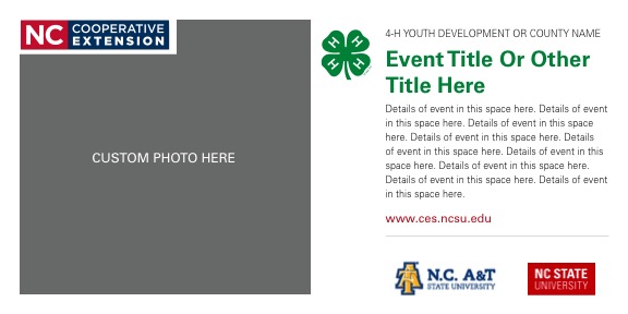
While the partnership logo should be used as a singular graphic whenever possible, there is flexibility to separate the N.C. Cooperative Extension block and university logos in certain situations.
In situations where production standards for the full N.C. Cooperative Extension logo can not be met – or when it adds meaningful aesthetic value to a resource – the N.C. Cooperative Extension logo and university logos may be separated.
This will most often be the case for items with small imprint areas, like an ink pen or some hats.
Logo Element Terms
The N.C. Cooperative Extension partnership logo consists of two main sections:
- The first section features “NC” in a red square and “Cooperative Extension” in a blue rectangle.

- The second section includes both the A&T logo and the NC State logo, which should always be grouped together as one graphic.



When Can I Separate the Logo?
If the university logos are too small to be legible (i.e. don’t meet publishing specs), then you may separate the two elements.
When doing so, closely follow these guidelines:
- Separate only the red and blue Extension block from the university logos.
- The university logos must still be used side by side as a singular graphic.
- The university logos may be enlarged relative to the Extension block, but must be the same size relative to one another.
- Even while separated, both logo elements – Extension block and paired university logos – must always appear on a communication resource.
- The Extension block can be used on the front page while the paired university logos are on the back page, for example.
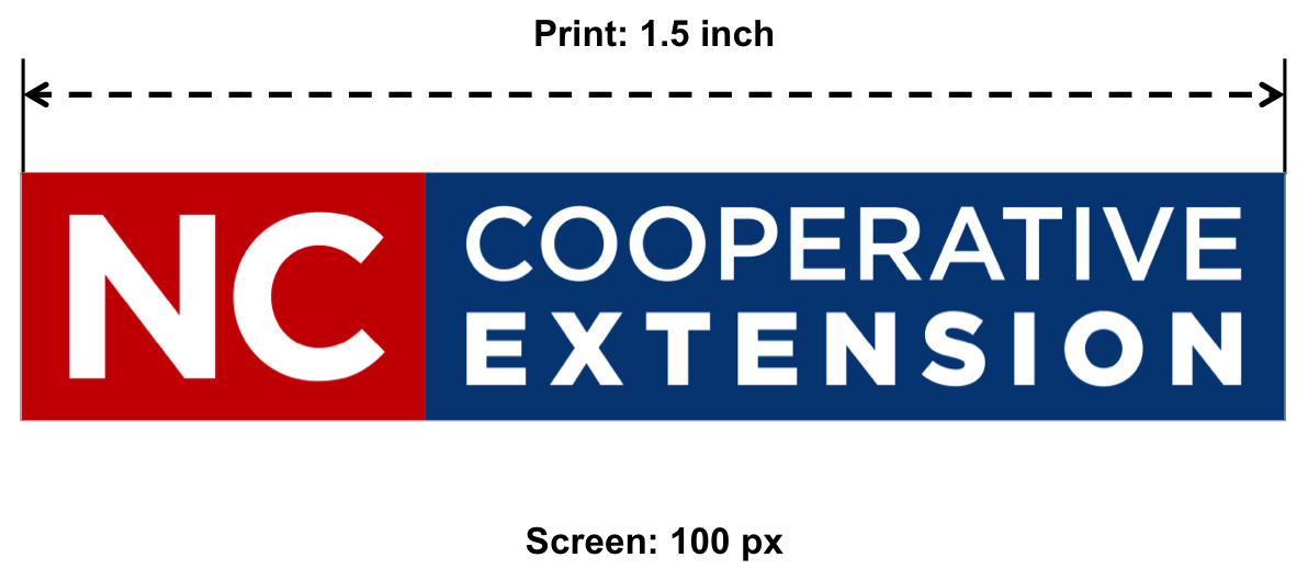
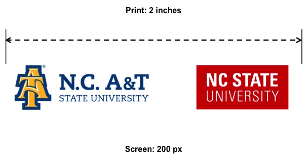
Logo Elements Production Requirements
Examples (click to enlarge)
Back to Top
Color
Color is one of the most recognizable elements of our brand. Our palette incorporates the core colors of our respective universities, reinforcing our land-grant roots and the value we bring to the table.
The primary color for N.C. Cooperative Extension is blue.
 HEX #004684 |
Additional primary colors include:
 HEX #CC0000 |
 HEX #FDB927 |
University Colors
For more information on our university color palettes and how to utilize them:
Secondary / Expanded Colors
While our core palette should always feature more prominently than any others, a collection of complementary colors can be used to highlight various content. They should be used thoughtfully, in moderation and in adherence to university guidelines.
Find a range of tints and shades for each brand color:
- Secondary Color Palette: Shades and Tints (RGB-HEX)
- Secondary Color Palette: Shades and Tints (CMYK)
Font
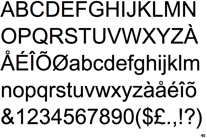
Arial is the primary font to be used in all N.C. Cooperative Extension materials and resources.
This family of fonts, and its accompanying versions, should be used at all times, in both digital and print materials.
Back to Top