Logo
The logo is integral to NC State Extension’s identity. Its directness, hard edges and unadorned type fit who we are: We are purposeful. We are modern. We are NC State.
There are two base configurations of the logo (Stacked and Horizontal). Use the appropriate version for your project.
Visit the NC State Brand site for more logo usage guidelines.
Color Logos

Black & White Logos
Color is preferred when possible, but there are also Black and Grayscale versions of the logo.

Visit the Downloads section for all NC State Extension logos.
Using the Logo
The designer may decide where to place the logo, so long as it is clearly visible in a prominent position on all communication items (e.g. publication cover, front page of a handout, intro/close of video, top of webpage, etc.).
Give the logo space.
As a rule of thumb, measure the width of the letter N in “NC State.” Text and any other design elements should be at least that far from the logo.
Minimum logo sizes.
Use the appropriate size in all materials, and remember to scale the logo proportionately.
The logo should never be recreated.
Logotype can never be transparent.
Never add elements to the logo
Visit the NC State Brand site for more logo usage guidelines.
Why Can't I Change the Logo?
Consistency is the hallmark of effective branding and marketing. Using the same logo in a consistent manner increases name recognition and immediate identification of the image with NC State Extension.
Over time, this repetition helps people apply the trust and value generated by all of NC State to our logo and NC State Extension. Changing the colors, orientation, font or text of the logo defeats the purpose of brand identity and is not permitted.
Logo Downloads
Find logo files below for various communication formats. View more details about the different image file types and how to use them for reference.
Print Folder
Contains EPS files, which are the only logos that should be used for print, as these vector files will print without loss of quality at any size.
Web Folder
Contains JPG logos that can be used for Microsoft Office documents, like Word and PowerPoint, or on websites.
4-H Folder
Contains logo files for Extension 4-H program marketing, including both the 4-H clover and joint 4-H / N.C. Cooperative Extension logo samples.
Visit the Downloads section for All NC State Extension logos.
Licensed Vendors
While there are thousands of promotional companies, shirt shops and printers, only university licensed vendors may produce products or promotional items that use NC State trademarks. Vendors may apply for a trademark license.
Visit NC State Trademark Licensing for more information.
Color
Color is one of the most recognizable elements of the NC State brand. By extracting hues from our university’s history and the people, places and things on our campus, we’ve created a broad palette that resonates visually and reflects who we are.
Primary Color Palette
NC State’s core color palette consists of three colors: Wolfpack Red, Wolfpack White and Wolfpack Black. These colors – particularly Wolfpack Red – should feature more prominently than any others in NC State Extension communications.
Wolfpack Red
HEX #CC0000
RGB 204 0 0
CMYK 0 100 81 4
PMS 186 C

Wolfpack Black
HEX #000000
RGB 0 0 0
CMYK 0 0 0 100

Wolfpack White
HEX #FFFFFF
RGB 255 255 255
CMYK 0 0 0 0

Secondary / Expanded Colors
While our core palette should feature most prominently, a collection of complementary colors can be used to highlight various content. They should be used thoughtfully, in moderation and in adherence to university guidelines.
Find a range of tints and shades for each brand color:
- Secondary Color Palette: RGB Shades and Tints (PDF)
- Secondary Color Palette: CMYK Shades and Tints (PDF)
- Adobe Swatch Libraries (.ZIP)
Font / Typography
Typography plays an important role in establishing and reinforcing our brand. Our typographic identity reflects NC State’s place as a bold, modern, straight-talking institution.
Find more details and guidance about NC State's brand typography.
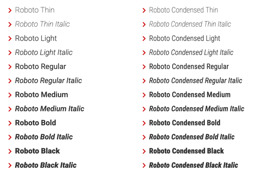
Primary Typeface / Fonts
NC State’s primary typefaces are Roboto and Roboto Condensed. These should be used most prominently in any design.
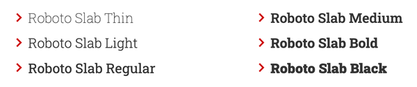
Secondary Typeface / Fonts
NC State’s secondary typeface is Roboto Slab. Roboto Slab should be used more sparingly and purposefully. It gives emphasis and personality to pull quotes, captions, facts and other types of content that stand apart from body copy.
Fonts for Other Situations
- Arial – Arial is a typeface that works across all media. Arial is an acceptable substitute and should be used anytime Roboto is not available or supported.
- Univers / Glypha — Univers and Glypha are NC State’s former primary and secondary typefaces. Existing projects using these are acceptable if converting to Roboto would be excessively costly or labor-intensive.
Type Guidelines
Review the Typography section of the NC State brand site for more details and samples. We’ve compiled a few key recommendations below for reference:
- We don't squeeze, stretch or skew typefaces when we scale them.
- We don’t set body copy in all uppercase letters.
- We keep blocks of text left- or right-aligned; don’t force-justify text.
- We only use type over an image if it is completely legible without altering the type or the image.
- Black type must be used over Hunt Yellow backgrounds to ensure legibility and accessibility.
- Use no more than two or three type styles (fonts), and limit the number of type sizes in any given resource.